

Your cart is currently empty!
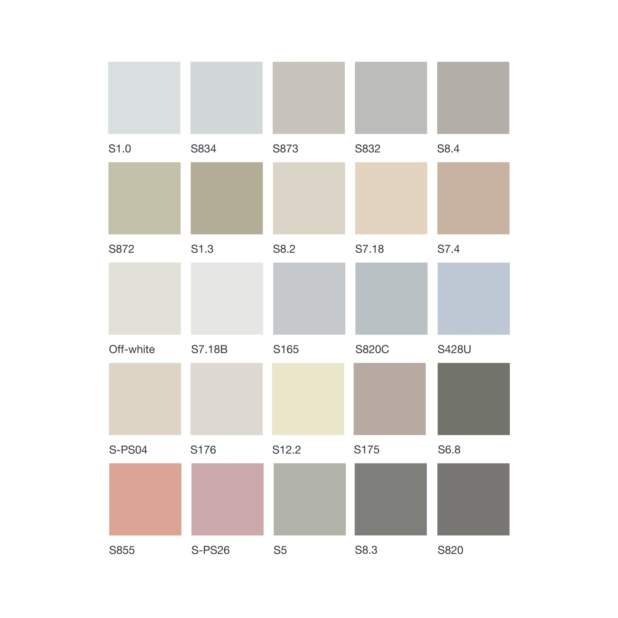
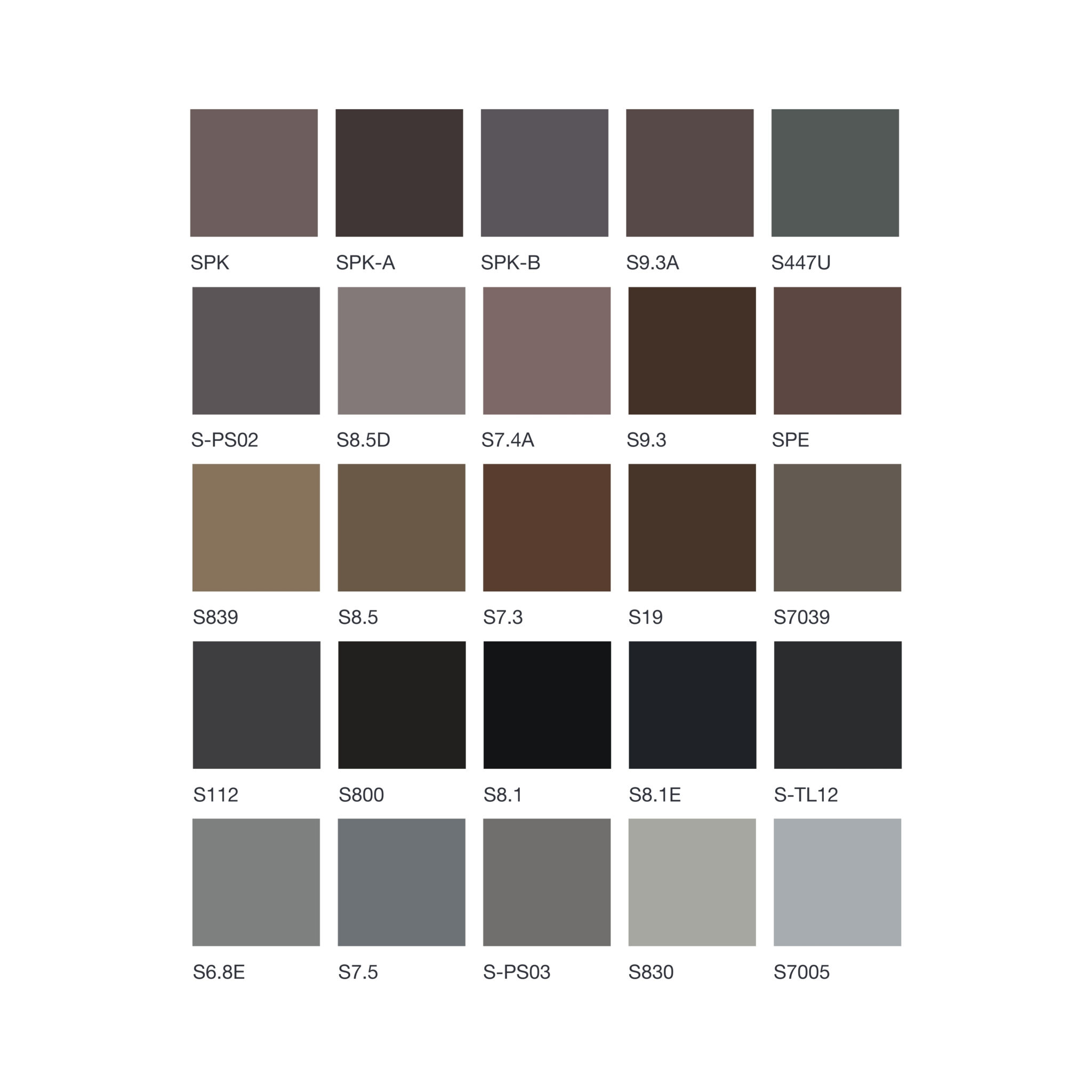
Color Palette with Aggregates
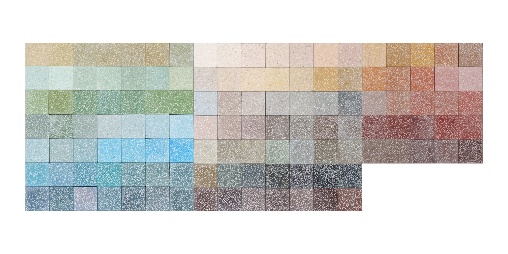
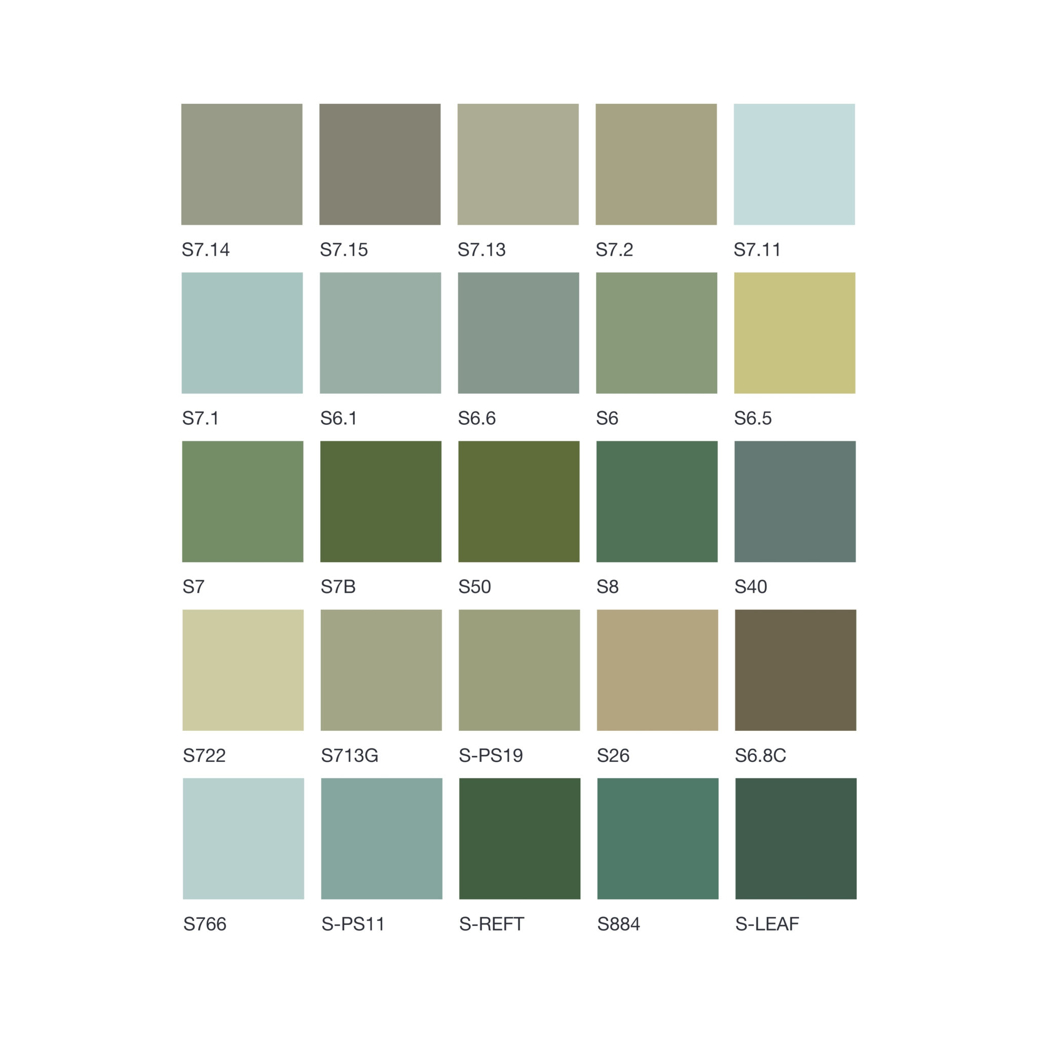
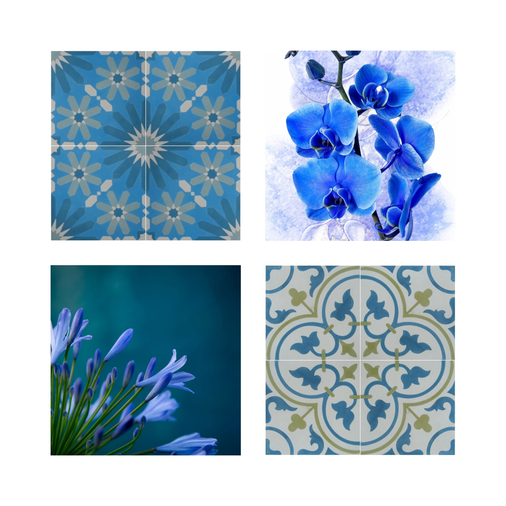
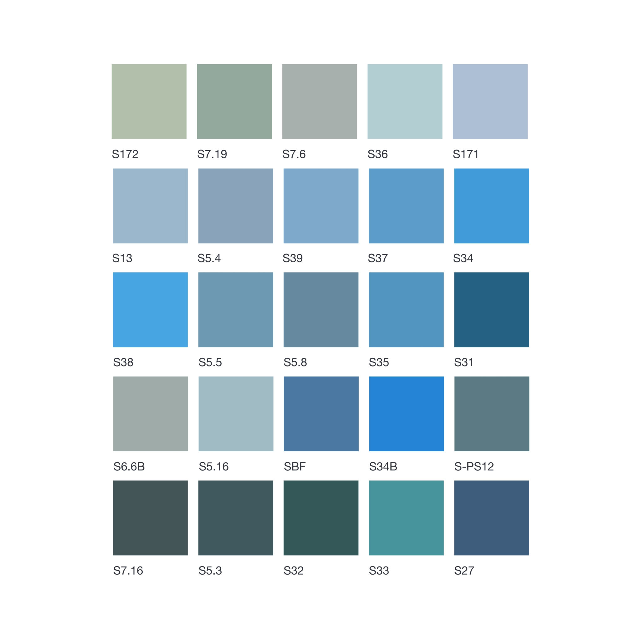
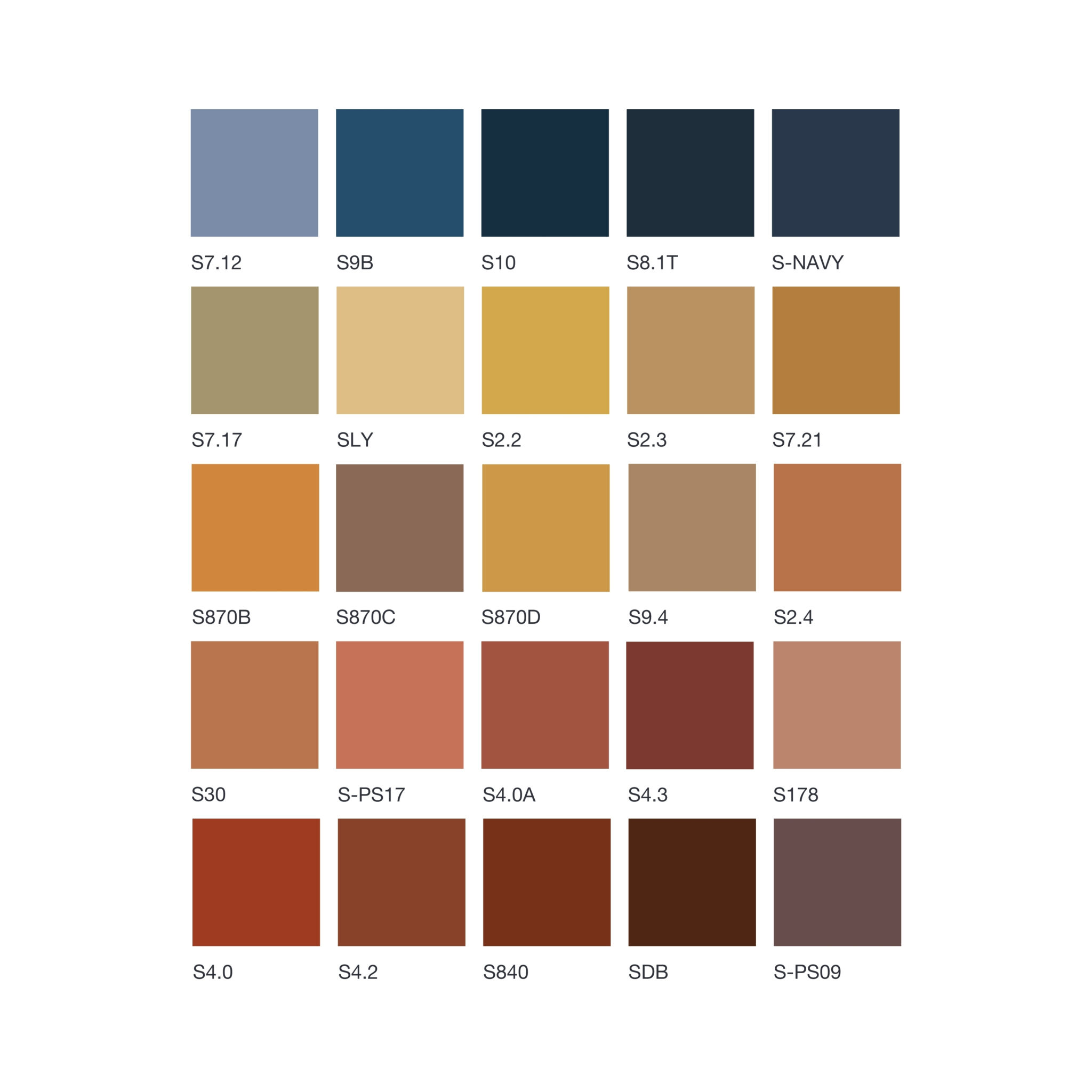
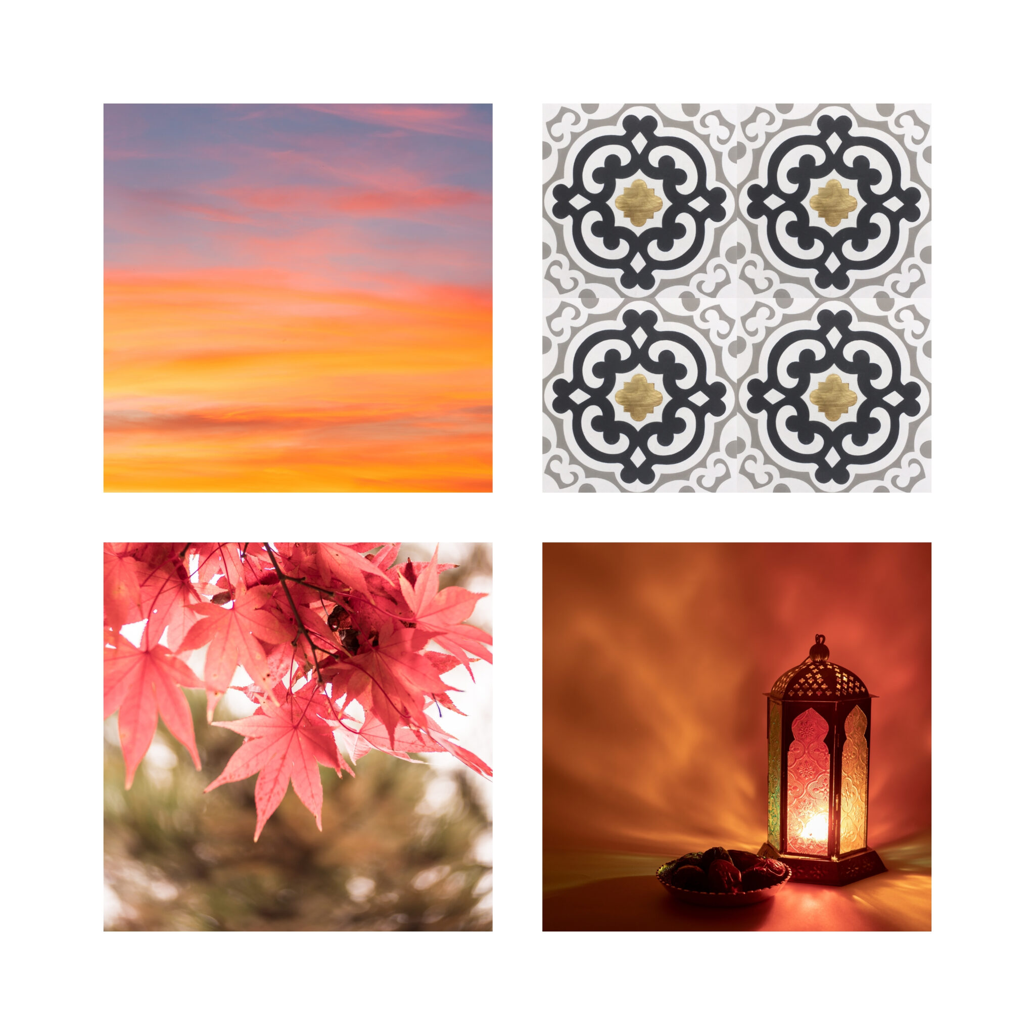
Original Color Palette
 |
|
 |
 |
 |
 |
 |
 |
 |
 |
How to Choose the Perfect Color Palette for Different Spaces
Selecting a color palette is more than just picking beautiful shades; it is a strategic design decision that defines the mood, scale, and character of an architectural project. Whether you are designing a minimalist residential apartment, a boutique restaurant, or a high-traffic commercial hub, understanding the emotional and structural impact of your palette is essential.
1. Embracing the Warmth of Nature (Earth Tones)
Biophilic design and sustainable architecture have brought organic, grounding tones to the forefront of modern interior design.
-
Best Applications: Living rooms, luxury hospitality resorts, cozy cafes, and rustic or Mediterranean-style spaces.
-
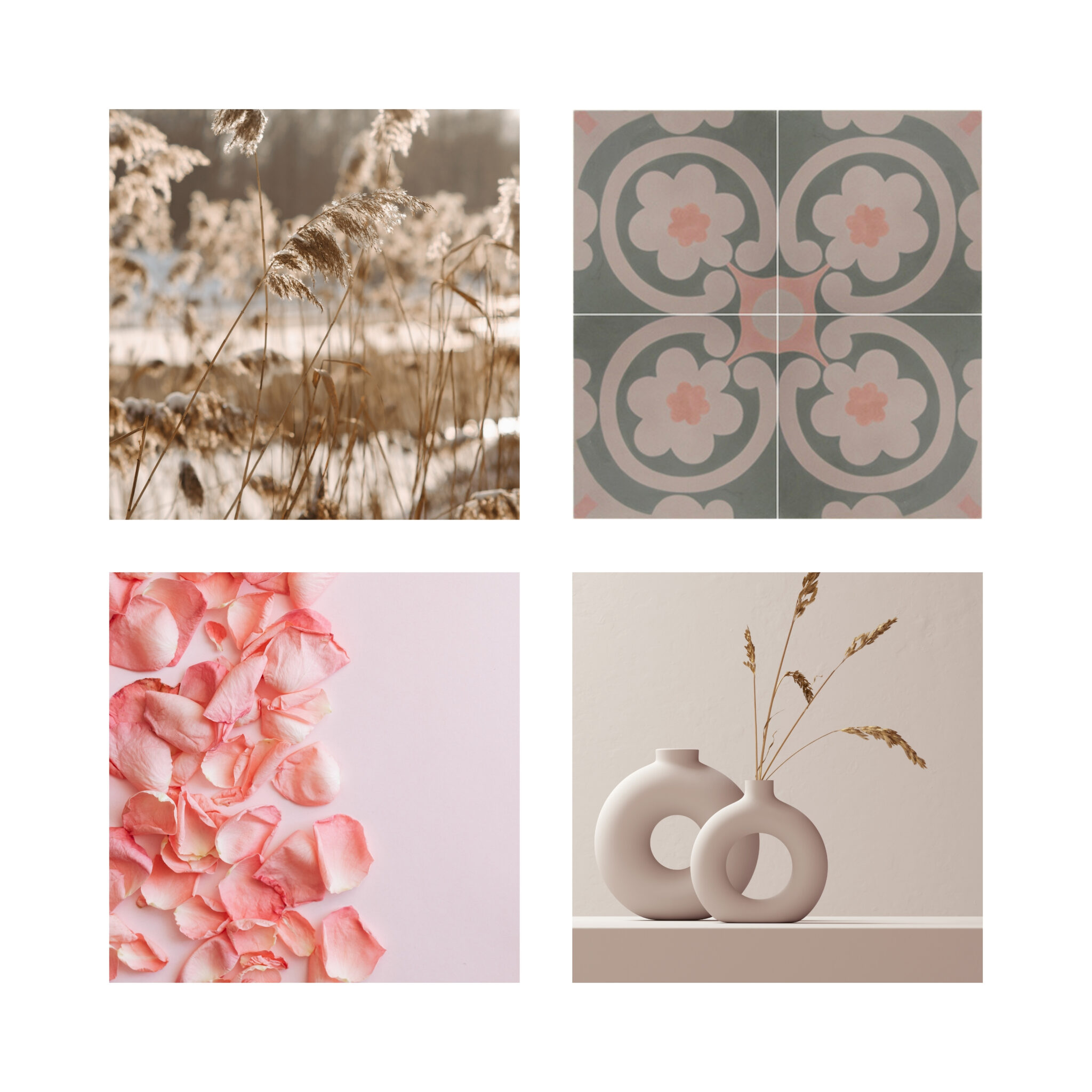
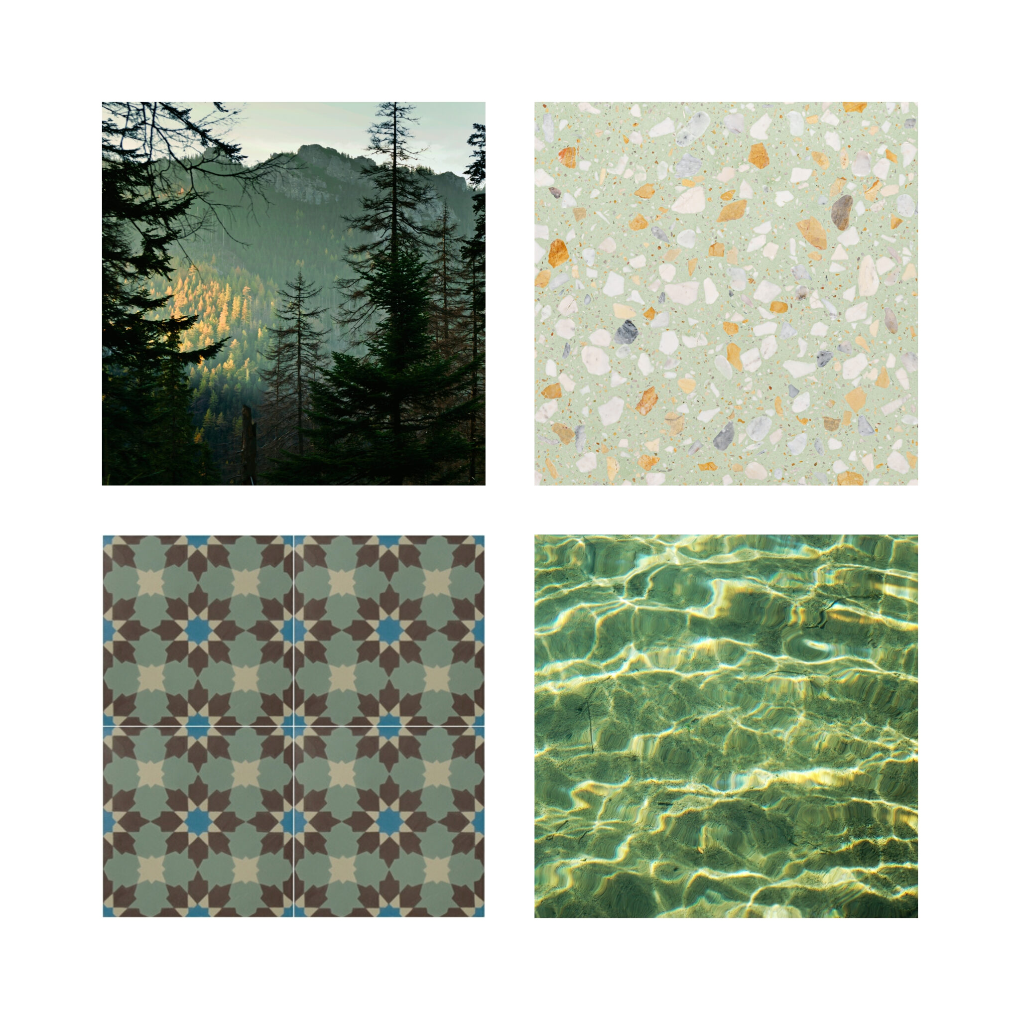
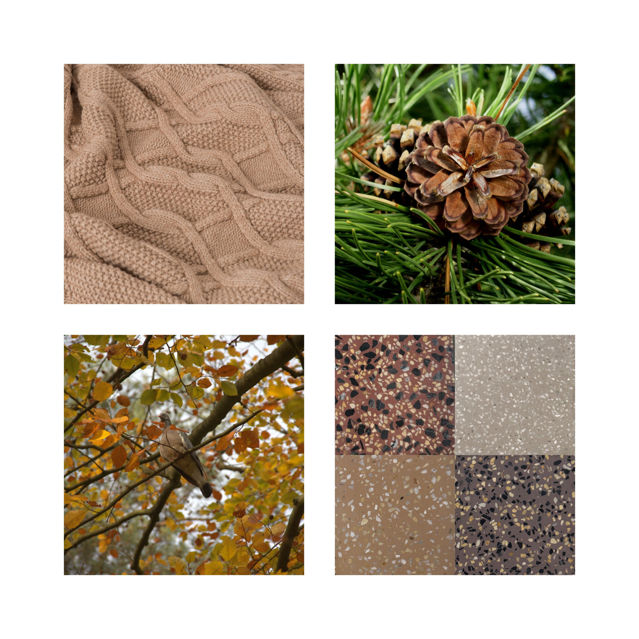
Design Insight: Incorporating earth-toned shades like terracotta, ochre, and sage green from our Original Palette creates an instant sense of warmth and comfort. When applied to the matte, velvety texture of handmade cement tiles, these colors shift subtly under changing light, giving walls and floors a rich, living quality that machine-made materials cannot replicate.
2. Sleek Modernity with Neutral and Monochrome Palettes
For projects guiding toward contemporary minimalism, industrial aesthetics, or sleek urban designs, a neutral color palette serves as the perfect structural anchor.
-
Best Applications: Commercial lobbies, modern bathrooms, open-concept kitchens, and sophisticated corporate offices.
-
Design Insight: A spectrum of clean whites, soft grays, and deep charcoal blacks creates a powerful, high-contrast backdrop that allows architectural lines to stand out. To elevate these neutral spaces, designers frequently opt for our Palette with Aggregates. The embedded stone and glass chips within the terrazzo tiles catch the light, adding luxury, depth, and structural texture without overwhelming the visual environment.
3. Making Bold Statements with Vibrant Contrast
If your goal is to inject energy, creativity, and a memorable visual identity into a space, a bold, high-contrast color scheme is the ideal choice.
-
Best Applications: Feature accent walls, decorative “tile rugs” in entryways, creative studios, and playful commercial spaces.
-
Design Insight: Pairing unexpected opposites within your color palette—such as a deep custom blue with a warm mustard yellow, or a rich burgundy with crisp off-white—creates a dynamic focal point. Using these combinations in geometric patterns allows you to direct traffic flow and highlight specific zones within an open floor plan.
A Step-by-Step Guide to Applying Your Palette in Interior Design
To achieve professional balance when working with Secoin’s extensive color system, architects and interior designers can rely on the timeless 60-30-10 interior design rule:
-
The Dominant Hue (60%): This forms the foundation of your space, typically applied to large surfaces like floors or main walls. For outdoor pathways or heavy-traffic commercial flooring, selecting a neutral base from our Palette with Aggregates is highly recommended for its exceptional durability and ability to naturally mask minor dirt.
-
The Secondary Hue (30%): This color supports the dominant tone while adding visual interest. Look for a coordinating shade from our Original Color Palette that is a few steps lighter or darker than your base to create a smooth, monochromatic transition.
-
The Accent Color (10%): This is your opportunity to break the rules and add character. Use a vibrant tile pattern or a striking hue on your breeze blocks to create an artistic focal point that immediately draws the eye.
Expert Design Tip: Lighting changes everything. A color palette that looks perfectly balanced under warm evening spotlights might look completely different under bright, natural midday sun. Because our tiles are crafted from raw, natural materials, we always recommend ordering physical sample pieces to test directly on-site under your project’s specific lighting conditions before finalizing your specifications.